Guest Blog: Abby Jarvis, Nonprofit Education Manager, Qgiv
Many nonprofits raise up to 50% of their annual revenue during the month of December. The end-of-year fundraising season is a whirlwind for fundraisers; there’s so much to do! That’s why we recommend planning your year-end campaign early... and why we’re sharing these nonprofit website best practices that will make your donation form more effective.
Encourage more donations with these 7 donation form design tips!
Design Tip #1: Make Sure It’s Mobile
This form is a great example of a mobile-friendly donation form. It loads quickly and is easy to use on all kinds of devices!
At this point, you know your donation form needs to be mobile optimized. Mobile internet traffic has outstripped desktop mobile traffic for a while now, and donation forms that aren’t usable on mobile devices will not perform as well as their mobile-friendly counterparts.
Mobile-friendly donation forms will include fields and text that displays nicely on various mobile devices. But other elements, like image sizes, lots of extra CSS, and other design choices can affect load times and usability, especially on phones and tablets.
One of the best (and easiest!) things you can do to make your donation form mobile-friendly is to compress your image sizes. When you compress an image, you make the file size much smaller. Smaller file sizes load much more quickly! Not sure how to compress an image? Try using a free image compression tool: I use this one, which includes options for both .jpeg and .png files.
After you’ve compressed any images you use on your donation form, try having a couple of friends visit your mobile donation form. They’ll be able to tell you if anything loads slowly or feels awkward while they look around.
Design Tip #2: Offer Suggested Donation Amounts
Have you ever had someone ask what you want for dinner and had your mind go blank? Even if you’re really hungry, deciding where to eat can be tough. Something similar happens to your donors when they land on your donation form: they want to give, but choosing an amount without any guidance can be hard.

This organization’s suggested donation amounts include a great range: whether you want to give $50 or $500, there’s an option for you!
Make your donor’s life easier by offering some suggested donation amounts. This can accomplish a few goals: it’s easier on your donors, who can choose from a range of gift amounts without thinking about it too much. Even if they decide to give a different amount (which, by the way, should always be an option), giving them a starting point will help immensely. Suggested giving amounts can also inspire donors to give more! If a donor lands on your donation form with the intention of giving $20 and sees a $25 suggested gift amount, they may well opt to just give the extra $5.
If you want to add suggested donation amounts to your form, here are some tips for you.
-
- Base your suggested gift amounts on the average size of the donations you get online. If your average online donation is $30, try starting there or bump it up to $35. If your average gift is $20, start at $25.
- Offer a range of gift sizes. Even if the majority of your donors gravitate toward $30 or $50 gifts, you may want to include a couple larger options for mid-level donors.
- Always include the option for a donor to choose their own gift amount. If your lowest suggested amount is $25 and someone can only give $10, they should still be able to experience the joy of supporting your cause!
You can make the most out of your suggested donation amounts with this next design tip!
Design Tip #3: Include Storytelling Elements on Your Form
When a donor lands on your donation form, they’re probably there as a result of a story you’ve told. Whether that story was shared through email, a social media post, or something else, it was compelling enough that they clicked over to your donation page. You can make them more likely to donate by including elements from the same story that compelled their visit in the first place.
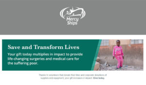
There are three real opportunities to include storytelling elements on your form. The first opportunity is at the top of your page; including a high-quality image and a short sentence or two that reiterates your story and the donor’s potential impact is a powerful tactic! The best images feature a single subject making eye contact with the camera and generally have a happy or uplifting feel. You can learn more about how to choose a great photo over here!
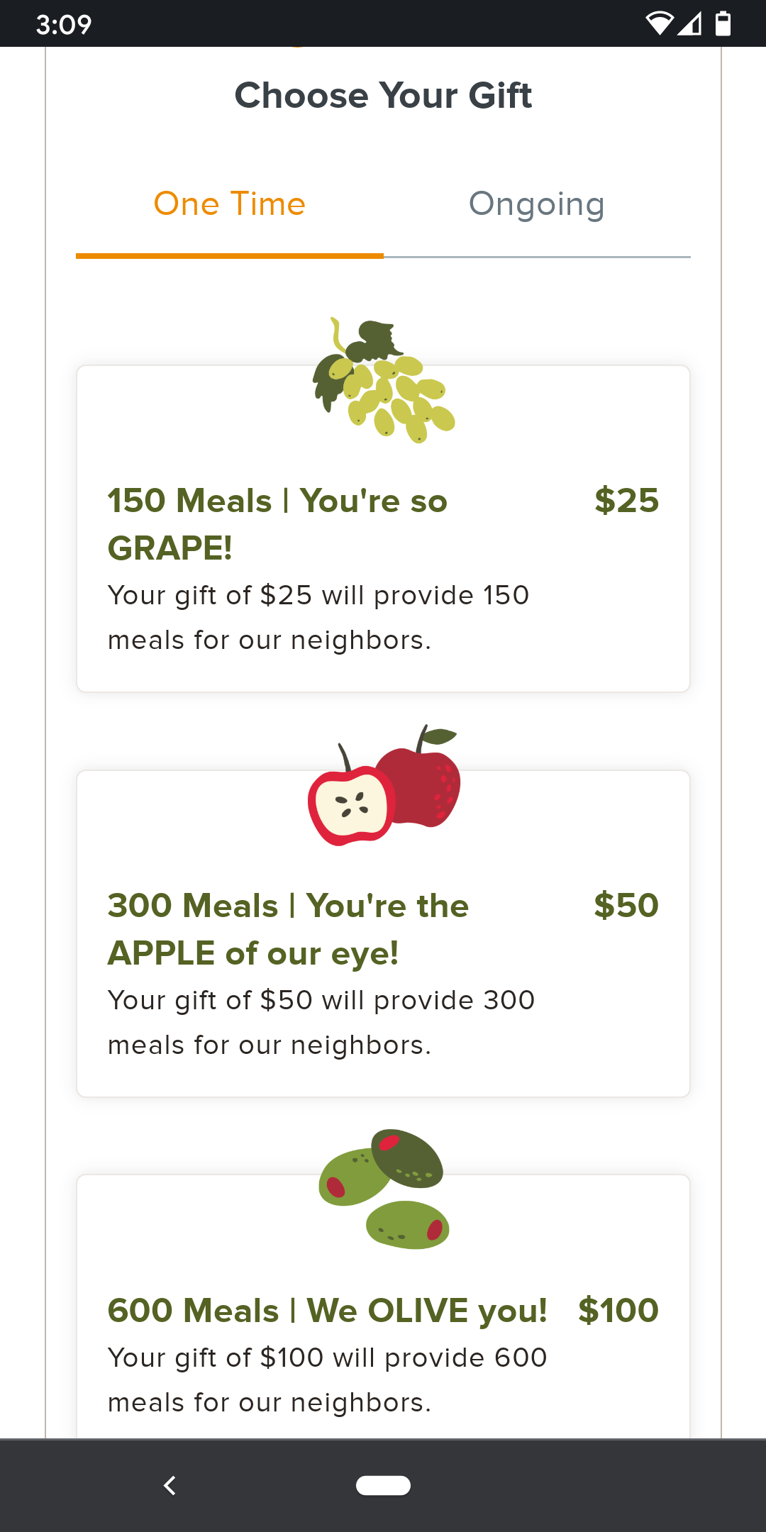
Your suggested donation amounts are also a great opportunity to add storytelling elements to your form. By adding some simple impact statements (and even photos!) to your suggested donation amounts, you can help your donors understand how their gift will make a difference and help them mentally tie their gift to the story that drew them to your form.

This organization combined a suggested donation amount, an impact statement, and a great photo to help donors understand how their gift can positively impact a real person.
You can also apply storytelling elements to your donation form by making subtle changes to the language on your form’s fields and buttons. Something as simple as changing the text on your submit button from “Donate” to “Feed a Family” or whatever impact statement is most suited to your campaign can make a big impression on donors.
Design Tip #4: Enable Recurring Donations
There are all sorts of reasons to try and recruit recurring donors. Regular donors give more over their lifetime than one-time donors, and they’re much easier to retain. Adding a few simple design elements to your donation form will help recruit new sustaining donors!
Draw attention to your recurring gift options by including language on your form about donors’ potential impact. Making your recurring options visible, then reinforcing them with a subtle impact statement, is a great way to let donors know about the importance of recurring gifts without overwhelming them.
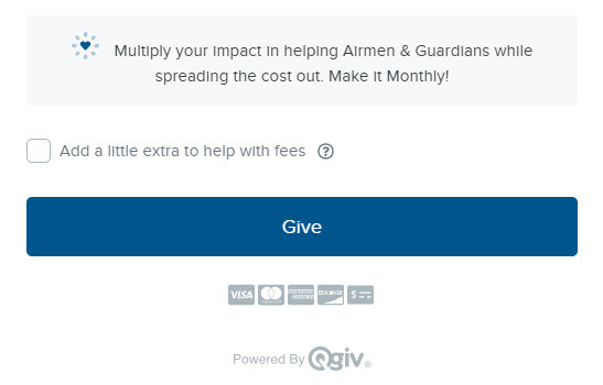
This organization added some subtle language to their form that encourages donors to make a bigger impact without spending a bunch of money all at once.
When you’re setting up your recurring donation options, you may want to consider using a range of suggested donation amounts that are slightly lower than the ones you set up for one-time donations. A $50 gift may be a reasonable one-time donation, but it's a big commitment for a monthly donation! If you have an existing base of recurring donors, find the average gift amount for that group and start from there.
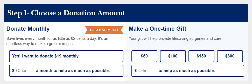
This group got creative with their form layout and displayed their one-time and recurring options side by side! Check out the subtle “Greatest Impact” banner on the monthly donation side and how the suggested donation amount is $19/month instead of the $50 suggested donation amount for one-time gifts.
If it works for your nonprofit and your campaign, you may also opt to reinforce your appeal for recurring donations with a pop-up module that appears at the end of the donation form. This is a bold move, and it can be very effective! If you decide to use a pop-up reminder, make sure you include a note about why a donor may want to make a recurring gift; even if they opt to stick with their one-time donation this time, they’ll remember your recurring options.
However you decide to display your recurring donation options, it’s important that your primary donation form does not default to a recurring donation. If you’re running a campaign or sending appeals that specifically ask for recurring gifts, defaulting to a recurring gift is okay. For all other appeals and donation forms, though, gifts should default to being one-time transactions. Making recurring donations the default can make one-time donors feel like you’re trying to trick them into making an ongoing gift, and that can hurt your conversion rates.
Design Tip #5: Keep It Short
Have you ever had to fill out a long form? Forms like the paperwork you do at a doctor’s office and even long forms for online purchases can be annoying and overwhelming. Even the most enthusiastic of donors may be dissuaded from making a gift if the donation form is long and asks for lots of information. You can boost your conversion rates on your donation form by making your donation form as short as possible.
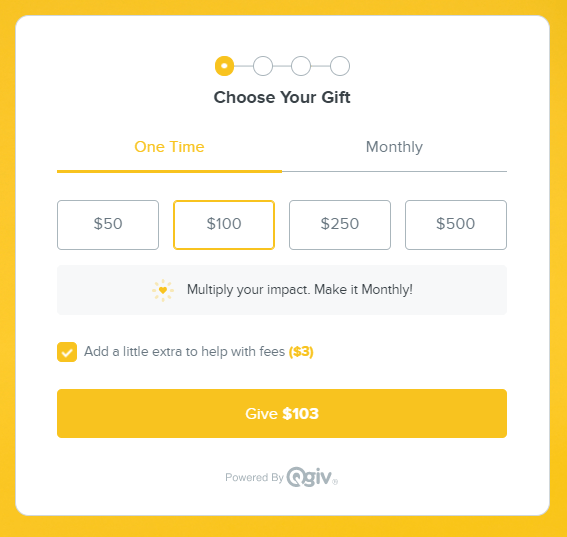
Asking donors to choose a gift amount before moving them into the next “chunk” of the donation form makes donors feel less overwhelmed.
When you set up your donation form, resist the temptation to ask your donors a bunch of questions. Demographic information, questions about why they donated to you, and other fields can be useful to fundraisers, but that information should be collected after your donor completes their gift. Adding any fields to your donation form that ask for information not necessary to processing their contribution can tank conversion rates, especially if donors don’t understand why you’re asking for that information.
Once you’ve eliminated excess fields, you can improve conversion rates even more by splitting the donation process into smaller pieces. This is called “chunking”—you’re splitting a task into manageable chunks. Cristina Ordaz, a Senior UI/UX designer at Qgiv, explains it this way: “’Chunking’ actually comes from psychology!” she explains. “This makes something feel less complicated, and sometimes that’s even more important than it actually being less complicated.”
Splitting your donation process into smaller chunks makes donors feel like they’re doing less work than they do on longer forms, even if they’re answering the same number of questions. When you eliminate unnecessary fields and split the donation process into a few smaller steps, you’re giving donors a better user experience and are improving the likelihood that they finish their transaction.
Design Tip #6: Remove Distractions from Your Donation Page
We’ve all done it at least once: we get online to knock out some work or answer an email, then we’re suddenly an hour deep into a Wikipedia wormhole about some obscure topic. Humans are easily distracted, especially when we’re on the Internet! That’s why it’s important to eliminate as many distractions as possible when building a donation form.
This organization removed navigation items from their donation page. When a donor is finished making their gift, the navigation items reappear on the confirmation page.
There are two big distractions to remove from your donation page. The first is navigation items and other outbound links. When creating your donation page, remove navigation items at the top of your form to eliminate the possibility of a donor clicking away from your giving page before they can finish their gift. Some nonprofits even opt to remove links in their donation page footers! You can always leave those navigation items intact on your donation form’s landing page so users can easily visit other parts of your site after they’ve made their gift.
The second distraction to eliminate is competing calls to action. If you include anything on your donation form that asks donors to volunteer, read an article, watch a video, or take any other kind of action, remove it! When a potential donor lands on your form, you want them to stay focused on giving to your nonprofit—asking them to do anything else, even if it’s something as simple as watching a video, can have a negative impact on your form’s conversion rates. Ask donors to get involved or do something for you on your confirmation page instead.
Design Tip #7: Embrace Trust Indicators
A trust indicator is any design element that reassures donors their transaction will be processed safely and their gift will be used wisely. For the sake of this article, we’ll split trust indicators into two different groups: security indicators that show donors their information is safe and trust indicators that assure donors their gift will be used well.
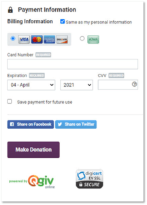
The lock icon and security certificates in this screenshot may not exactly fit your donation form’s aesthetic, but they’re a useful way to remind donors that their information is safe.
The first group, security indicators, include things like security certificates and the “https://” URL prefix that shows your page is encrypted. Security certificates and the like are not known for being particularly aesthetically pleasing, but they’re useful! Your donors want to know that their personal and financial information will be kept safe, and security certificates reassure them that it will. Even small visual assurances that your form is safe will improve conversions on your form: in a study from NextAfter, including a lock icon to the payment information section of donation forms increases donations by 95%!
The second group of trust indicators show donors that their money will be used wisely. Some nonprofits opt to include badges from Charity Navigator or Guidestar to their forms to show donors they’re established nonprofits with good reputations. Others choose to include graphics that break down how they spend their money, which is a useful way to address donors’ concerns about how much of their gift will go to the mission. Either style of trust indicator shows donors that they’re supporting a responsible nonprofit that will invest their donation wisely.
0 Comments